
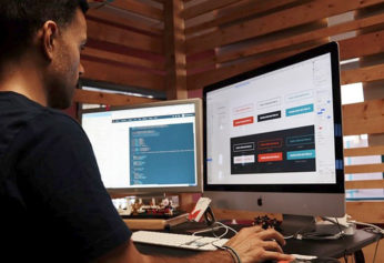
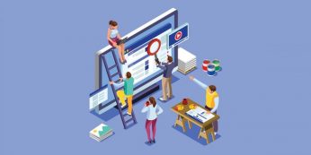
| Online presence is one of the leading factors in successful business practice across all industries today. Though we’ve been walking the path toward a digitized economy for a decade or two, the pandemic shifted that transition into high gear. Now, if a laundry’s website is hard to find, navigate or even look at, the consequences can be significant. No longer are reputation, print advertising and location the main drivers of business. Online presence, design and visibility are essential elements of an effective prospect outreach strategy. If you’re wondering whether your website is helping or hurting business, here are some questions to ask. In Part 1, we looked at questions about how trustworthy your site looks and if it’s fast enough. This time, we examine questions about the findability and security of your site. CAN PROSPECTS FIND YOUR SITE EASILY? Search engines are the crossroads of the Internet where nearly 93% of all the web traffic flows. When prospects want to find services you supply, they’ll search for it in a search engine and, if your site is search engine optimized (SEO), there’s a good chance you’ll be one of the first choices on the results page. If it’s not, your competitors who are optimized will likely get that lead. • A simple SEO test To get an idea of where you’re at, search for your company’s name in your preferred search engine. If it shows as the first or second result, that’s a good start. Now, search for a product or service you provide like a prospect might. It could say “linen service in (your town or city)” or “uniform rental near me.” If your site is in the top five, that’s great. If not, things could be better. When looking to rank high for certain keywords, it’s important to have content built around those keywords. If they aren’t present on your site, or if the content around them isn’t written well or with SEO principles in mind, you will have a hard time ranking well enough to be seen. Read more: Is Your Website Helping or Hurting Business? |

| 2021 will most likely become the year of major changes and drastic breakthroughs in the field of web design. We can already witness exciting color palette solutions and original uses of gradients and duotones, and from this post, you’ll discover the main trends in the color schemes for websites in 2021 that are not to be missed. Keep reading if you want your designs to be fresh and up to date. Top 5 Color Trends to Follow in Web Design So what are the hottest color trends 2021 that every web designer should follow? Dark Mode Dark themes are the latest trend in app design. After Apple had finally released dark mode for iPhones and macOS, it was only a matter of time before it appeared everywhere. Top web design agencies also decided to implement this mode for their solutions. Once they were rare, now dark themes are everywhere. When done well, the dark mode has many advantages. It reduces eye strain, making the nightly online experience much more pleasurable. They are easier to read in low light, like while on the subway or a bus. And they can significantly reduce battery consumption. Gradients Gradients and color filters have been around for a couple of years now and still haven’t lost their popularity among designers. First, color filters started becoming popular because of the Instagram-oriented public mentality, but now they are used to create additional textures and add more depth to basic colors. As for the successful examples, check out Grammarly’s social networks. They use gradients instead of flat colors for their graphics. Read more: Color Trends in Web Design: 2021 Edition |
| A million different things go into running a business, so it can be alarmingly easy to forget some crucial components. Arguably the most important of these is your website. It might surprise you to learn just how significant your digital presence is and the impact it can have on your audience. Of course, as an eCommerce owner, you already know that a website matters in terms of purchases—without one, your customers wouldn’t be able to buy your products. But what you may not know is the influence it has on consumer assumptions about your brand. There’s a lot more to an eCommerce website than its product page and shopping cart. Here, we will be explaining all of that to you and why effective web design for eCommerce matters. It Is the Store-Front of the Digital Age For better or for worse, the high street is declining in popularity, and the importance of online marketing is increasing. As one Europe digital agency explains, rather than your shop window, customers will be judging your website. It could be the deciding factor between a purchase or a pass. If you want to secure a larger audience, you need to ensure your shop window is looking its best. If a potential client lands on your site and finds the site disappointing, they won’t bother looking at your products or services. Don’t get lax, and don’t let customers slip through your fingers—invest in web design! Read more: The Importance of Effective Web Design for eCommerce |

A well designed website can provide you with faster results.
Who doesn’t love faster results and more sales? If you’re like most businesses, then you’re always finding ways to scale your business.
A great way to minimize your risk while driving results is to work on a growth-driven design for your website. This allows you to focus on data and audience analysis to make changes for the needs of your visitors.
We’ll dive deeper into what growth-driven design (GDD) entails, along with the differences between traditional website design and GDD, and great tools to help you on your website design journey.
What Is Growth-Driven Design?
Growth-driven design, often shortened to GDD, is a progressive approach to website design that helps businesses drive optimal results while reducing common pain points for their site visitors. A website design that is growth driven is optimized for lead generation, offering frictionless conversion paths so visitors can convert easily.

The world craves minimalism.
So much so, that whichever aspect of our lives you look at – whether it is the lifestyles we lead, homes we live in, or the products we consume – minimalism is present in every facet.
Even the smartphones in our pocket prove that minimalist design has more than caught on.
Why Minimalism?
Often confused with simplicity, the concept of minimalism entails reducing all elements to only include those that are essential.
This means that while minimalism is simple, simplicity, or using simple forms, does not necessarily translate to minimalism.
In the world of design, minimalism is used to directly convey the message without the unnecessary noise and obstruction of focus due to other distracting elements.
Seeing the benefits of using minimalism to swiftly and effectively convey the message, the minimalist approach has taken root in many branches of design.
From painting and sculptures to digital product design and web design, minimalism has managed to root itself and understandably so.
Designed with minimalism in mind, digital products and web designs are no less impressive.
Apple’s brand is one of the best examples of having a minimalist approach in mind when designing products.
The design itself is clean and sleek, and it puts an accent on every aspect of customer experience – from the first moment you hold an iPhone packaging in your hand, peeling off the foil of your screen, to finally using the smartphone.
Minimalist designs are visually appealing and user-friendly, so it’s really not surprising that so many businesses prefer to have a minimalist web design, as it helps them boost their company’s bottom line.
Taking Minimalist Approach to Web Design
Your company’s website is the best business card you have.
It tells your customers all they need to know about your business – from where to find you to what the business is all about.
Read more: 3 Tips to Master a Minimalist Web Design

If you’ve ever grown your own plants, you know that they tend to grow toward the sun. This makes sense; they rely on the sunlight for sustenance, so they’re going to do everything in their power to make sure that they get as much of it as possible. To use an analogy, the same thing goes for online marketing. Companies want to be able to go in the direction of where their prospective customers are. They’re doing it for the same reason as the plants: sustenance.
Over the years of running an online marketing company, I’ve found that there are some often overlooked marketing techniques that have helped businesses, even niche businesses, to grow. Perhaps foremost among these, web design is a bigger deal than many people realize.
There’s More To Web Design Than Looking Good
So many small business owners often think that the only goal of a website is that it looks great. They want something flashy, eye-catching and attractive. That’s all well and good; it’s even important. However, good web design has many benefits beyond that, too. Quality web design should be easy to navigate in practically every way possible.
Website = Online Storefront
A good analogy is to think of your website as a store. For many small businesses that don’t have physical storefronts, it is, for all intents and purposes, an actual store. When you walk into a store, you want to be able to move around. You want to be able to check all of the wares out — easy access to what you came for, as well as exposure to some items that you might not have realized exist. That’s a well-laid-out store in practically any industry.
Read more: How To Think About Web Design To Market Any Kind Of Business In 2020
2020 is moving quickly. Already 2 months in and business is not slowing down.
It is time to begin updating your website to meet demands. As the year goes on, new announcements will spike interest amongst new and prospective customers. Be ready to have a high volume of customers browsing through your website at any given moment.
Since it is the turn of a new decade, why not spice things up and revitalize your existing website? Change is always good, especially if it can benefit the flow of traffic your business receives. With that being said, there are plenty of ways you can revitalize the look of your website to keep customers interested in your page.
Maybe it’s time for a new look! No, we are not talking about rebranding, just changing up the interface of your website. You wouldn’t want it looking 2019, that was last year’s trend. It is now time to add a more meat to the bone and keep users and visitors interested with an eyecatching new look.
What new interface will help revitalize my website?
We have the trendiest website looks that you can pull inspiration from!
Website Trends:
1. The 3D Look:
People are attracted to anything that pops out on a website. Through the right 3D animation, you can help potential and returning customers visualize your product or better understand what your company does.
Read more: Website Design Trends for 2020
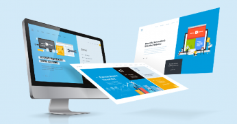
Quite often, web design is used interchangeably with web development, but are the two synonymous? In this article, I take a look at what web design entails in a bid to enlighten those who would like to pursue a career in web development and those who just want to satisfy their curiosity on the subject.
Web development and its 3 heads
The web development process generally involves three main phases. These are web designing, front-end development, and back-end development. Each stage is normally done by a person who specializes in that particular phase of development, although there are some web developers with more than one skill. A person with skills in web design, front-end, and back-end development is known as a full-stack web developer.
Not all developers end up as full-stack developers. If you identify with the philosophy that a jack of all trades is a master of none, then you should be content with specializing in one aspect of web development- like web designing.
A web designer plays a crucial role in the creation of webpages. A webpage is a document you access when you visit a website. The two words-webpage and website- are sometimes used interchangeably, but that is a story for another day. So what does a web designer do?
Designing the web…
The web designer creates a layout of elements that appear on a web page. The elements range from text, images to videos.
A logo and favourite icon (favicon), are among images that can be found on a webpage. The logo and favicon are part of a brand. Sometimes the web designer is tasked to design the brand or to ensure that existing images are in a certain format and size for the best user experience(UX). The logo typically appears on the navigation panel of a webpage while the favicon is visible in a web browser’s history and it may also appear on home screens of mobile devices.
Fonts and colours on a webpage are also chosen by a web designer and they usually resonate with the brand. The web designer comes up with colour scheme codes for use by developers later in the development process since colours are rarely referred with their names in web development. The web designer also makes sure that the correct fonts are used. Now you might be wondering what skills should a web designer possess?
Read more: What Is Web Design?
When you’re trying to improve your website’s performance, it’s important to remember that you have to focus on numerous factors simultaneously.
In both life and digital marketing, we tend to give all of our attention to one or two important elements while neglecting something else that can turn out to be equally as important.
If you want to do better in the SERPs, it takes more than just SEO.
Your website also needs to be designed well, or you risk squandering all of that organic equity you have been building.
SEO and web design work together more seamlessly than many people might realize.
Their components mingle and flow together so well that, when executed correctly, your website visitors should not actually notice anything about what you have created; they should simply start navigating through your site.
So, what are those elements where SEO and web design collaborate? Check out these five ways they are used together.
Read more: 5 Ways SEO & Web Design Go Together
Do you think of SEO and web design as separate elements of your website?
You shouldn’t.
In fact, to do both correctly, they have to work together. Google cares about how your site looks and feels more than you might think it does. Even if it can’t “see” it the same way a human user can, there are benefits to building a responsive website that will make your SEO more solid than ever.
Building rapport with Google takes more than keyword frequency. Here’s how you can make your website show up higher on search rankings and stand out from the pack:
1. Mobile matters.
At the end of 2017, Google announced on its webmaster blog that it was going to start indexing mobile sites first. Previously, the desktop version of a website was the one that would get indexed. But from then on, Google slowly began rolling out a mobile-first program.
Google knows what it’s doing. According to a Quartz report from media agency Zenith, 70 percent of all web traffic came from smartphones in 2017. And that number is only expected to climb.
Read more: 5 Ways Solid SEO and Web Design Work Together to Build Rapport With Google