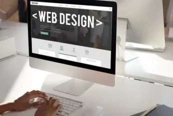
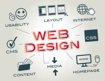
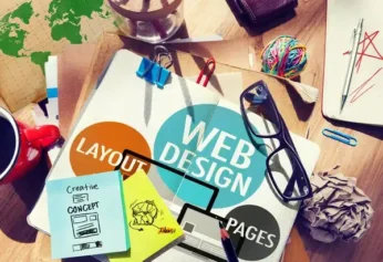
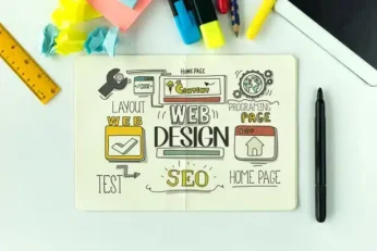
As published by Nerdbot in “Web Design Trends Going Into 2026,” web design continues to advance with new approaches focused on user engagement, functionality, and visual storytelling.
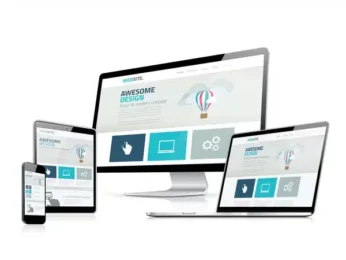
Businesses that stay informed about emerging design trends can create more effective websites that meet evolving customer expectations. Adopting modern design practices can help improve user experience and strengthen online performance.
Click here to learn more about Total Web Partners’ digital marketing solutions or here to read the full article.
Article with all rights reserved, courtesy of Nerdbot — https://nerdbot.com