Menu

All posts tagged Web Design

Total Web Partners: Leading the Charge for Web Accessibility

In the enlightening piece “Good business will be accessible by all – at least online” on TechHQ, the importance of web accessibility is underscored as a fundamental aspect of website design and development. Recognizing the significance of creating inclusive online experiences and is committed to ensuring accessibility for all users.

Web accessibility should be a primary consideration for architects, developers, and organizations aiming to create high-quality websites and web tools. Tim Berners-Lee, the inventor of the world wide web, emphasized the universality of web access, stating that “access by everyone, regardless of disability, is an essential aspect.”

Ensuring web accessibility means designing and developing websites, tools, and technologies that can be used by anyone, regardless of their abilities or disabilities. It aligns with the basic human right to access information and communications technologies, as recognized by the United Nations Convention on the Rights of Persons with Disabilities.

Moreover, web accessibility not only benefits users with disabilities but also enhances the user experience for non-disabled individuals, including older users and those facing situational limitations. Understands that accessibility is not just about compliance but also about improving overall user satisfaction and driving innovation.

By prioritizing web accessibility, businesses can enhance their brand, extend their market reach, and drive innovation. 

Click here to learn more about Total Web Partners’ services.

Article with all rights reserved, courtesy of techhq.com

Photo with all rights reserved, courtesy of depositphotos.com.

Web Development vs. Web Design: The Differences You Need to Know

If you are thinking about a career as a web designer or web developer, there are some things you should know about the concepts. Even though they share some similarities in terms, they have subtle differences that make them unique. This article will discuss their differences, roles, and how you can choose between them.

Web Development vs. Web Design: The Differences
The main difference between developers and designers is that developers focus primarily on technical aspects, like coding and programming. Designers are responsible for the conceptual and visual work necessary to create a solid UI and UX. In contrast to designers who emphasize appearance and usability, developers emphasize structure and functionality.

Web Designer: This graphic artist designs website layout, functionality, and visual appeal. Web designers are skilled in creative, graphic, and technical areas.

Web Developer: These developers create and maintain the core structure of a website. Web developers are responsible for converting the web design into a functioning website using PHP, HTML, JavaScript, and Python via specific web development services.

Read more: Web Development vs. Web Design: The Differences You Need to Know
https://www.startupguys.net/web-development-vs-web-design/

5 Web Design Trends to Watch in 2023

A new year is typically a time for new ideas, approaches, or ways to make life a little better or more enjoyable. For web designers and users, improved ways to design websites is always high on the list.

In the following post we’ll be addressing 5 new web design trends that address issues like accessibility, UX, and responsiveness as well as 10 pre-built websites from BeTheme that show how to effectively use them.

With 268,000+ sales and a 4.83/5 star rating, BeTheme is one of the world’s most popular and highly-rated WordPress Themes.

5 web design trends to look out for in 2023

In order to improve something, you first have to have an understanding about the things that can impact it, both positively and negatively. For web designers, that “something” is a user’s digital experience and how 5 design trends that can positively impact a digital experience could best be implemented.

  1. Hoverable iconography
    A top web design priority is how to go about creating interfaces that require minimal effort on the part of the user to interact with them, i.e., they are as intuitive as possible. Shortcuts that make things easy for the designer can, however, have the opposite effect on the user – especially when it comes to iconography.

Some icons, especially those used in headers, are so commonplace that any user can interpret their meanings and use them appropriately.

Read more: 5 Web Design Trends to Watch in 2023

Experts Share Tips on Strategic Web Design for Successful Digital Marketing

Website is the second most popular channel used for marketing purposes in 2022, according to HubSpot. While it’s important to note that 59% of users, as per Adobe, prefer “beautifully designed’” sites compared to “something simple and plain,” 88% of users won’t return to a website due to poor UX, as reported by Amazon Web Services. Hence, businesses need a website design strategy that combines visual appeal and usability to engage and convert users.

DesignRush, a B2B marketplace connecting businesses with agencies, leveraged its 13,000-agencies-strong network for quick insights – or “QuickSights” – on the strategic web design tips for digital marketing.

1) CAPTURE ABANDONED CARTS VIA EMAIL SIGNUP

Forge Digital Marketing CEO Erin Schnittker Siemek states that installing email integrations and leveraging exit and shopping intent popups to collect emails on websites is a winning combination to capture abandoned carts.

“If you have an eCommerce business, we stress the importance of creating integrations with Klaviyo on your website,” said Siemek. “Design a user experience that converts first and foremost, but the second best thing to [help increase] sales conversion[s] is email signup. [Therefore] structure your website and email integration to capture abandoned carts and use strategic exit intent and shopping intent popups to grow that email list […] A website that uses these techniques can expect to add 30% to their bottom line of revenue by correctly deploying email capture within your web design and development plan.”

2) DECLUTTER YOUR SITE FOR FASTER LOAD TIMES

In the opinion of Rahul Jain, founder of SlashMonk, decluttering is a key tactic to incorporate on websites because it helps improve usability and search engine rankings.

“Speed is key when it comes to website usability,” said Jain. “That’s why one of the best ways to improve [it] is by decluttering your site. By eliminating unnecessary elements and formatting, you can significantly reduce the time it takes your website to load. Not only will this make your website more user-friendly, but it will also boost search engine rankings. So go ahead – clean up your site and see the dramatic improvements it makes in both usability and search engine rankings!”

Tabitha Jean Naylor, owner of TabithaNaylor.com, adds that optimizing websites for fast speed is essential since delays can cost businesses a significant number of leads.

“An extra 5 seconds on your page load time can mean losing 20% of your leads,” said Naylor. “Optimizing website speed will ensure your potential customer stays long enough to engage and realize that they need your product. Compress images, get rid of unnecessary plugins and minify website code for faster speeds.”

Read more: Experts Share Tips on Strategic Web Design for Successful Digital Marketing

Web design trends for creative portfolio websites

As artists, we all have something in common: We need an online portfolio to showcase our (design) skills, talent and creativity. A portfolio website also helps clients or employers to imagine what they can expect when they hire you. But how can you make your portfolio stand out?

Before you start designing your website, make sure to complete these three things:

  • Step 1: Think about what goals you want to achieve with your portfolio website.
  • Step 2: Pick your best work.
  • Step 3: Tell a story.

In other words, decide what information your portfolio must include to speak to potential clients or employers. Then, wrap it into a story about yourself and your work.

Once you got that lined up, let’s start with the actual design of the portfolio website. The following UX design trends will make your website glow up in no time!

Choose a simple and minimal design
Too many visual elements can be overwhelming. A clear and minimal design, on the other hand, improves your website’s navigation. Uncluttered pages make your work shine, as they guide visitors to focus on the elements you want them to focus on. If your portfolio is rather cluttered, consider giving it a simpler design. In some cases, this can improve user experience, which also has a positive effect on search engine optimization and your search engine rankings.

Add interactivity
Today’s websites are more than static pages. Everything is getting faster and more dynamic, and so are websites. Adding interactive elements to your portfolio gives it a unique design and makes it stand out. If you’re rather inexperienced in web design, start out by experimenting with interactive elements such as color shifts or animated fonts.

Create a prominent “About Me” page
The first thing a visitor of your portfolio wants to see is your profile. They want to get to know you and your story. By prominently placing your “About Me” section at the start of your website, you can draw visitors in. They might spend more time on your website, which is also one of the factors that improve your website’s search engine visibility.

Add a headshot
To pep up your profile, you can add a large headshot. This helps your visitors to connect with you and your character upon opening your website. It also signals your visitors that they are looking at a portfolio. Next to your headshot photo, you can place interesting information about yourself and your work.

Whitespace
When it comes to designing the portfolio layout, make sure to add a lot of whitespace between the elements. The current trend of minimalistic design goes hand in hand with a clear layout. By adding lots of whitespace to your portfolio, you can highlight certain works and improve readability.

Read more: Web design trends for creative portfolio websites

Responsive Web Design Principles

Nowadays, it’s common practice to build a website or app that adjusts its user interface depending upon the browser or the device. There are two approaches to achieve this goal. The first involves creating different versions of your website or app for different devices. But it’s inefficient and can lead to unpredictable errors.

In a search for a reliable, future-proof approach, the responsive — or adaptive — design was coined. It focuses on building a single version of your layout that adapts to different browsers or devices automatically.

In this article, we’ll learn about responsive web design and the fundamental principles that will help you make an awesome website.

Responsive Web Design Ingredients

Responsive web design is not as complicated as it sounds. It’s a set of practices that you can use when writing CSS, not a separate technology that you’ll have to learn from scratch. You might already be following several of these principles without realizing it. You can understand responsive web design by exploring its four ingredients: fluid layouts, responsive units, flexible images, and media queries.

Fluid Layouts

With a fluid layout, you can create web pages that adapt to the current viewport width and height. Common practice includes using the max-width property instead of giving a fixed width to an element. Also, using percentage (%), viewport height (vh), or viewport width (vw) helps improve adaptability that is not possible with pixels (px). So, next time you’re building a layout, make sure to introduce these small changes and start benefitting from responsive design techniques.

Responsive Units

As you move to more advanced CSS, you’ll often see the use of rem and em units for length instead of px units. This is because the rem unit makes it super easy to scale the entire layout. By default, 1rem equals 16px because it’s proportional to the <html> element’s font size, typically 16px. However, you can set 1rem equal to 10px (or any other value) for easier calculations, by adjusting the top-level font size.

Read more: Responsive Web Design Principles

Your website could be doing the environment dirty. Here’s how to clean it up.

No trees are seemingly cut down every time you Google something or read a social media post on your phone or laptop.  But websites alone do create emissions—internet usage is responsible for almost four percent of global emissions. That might not seem like a lot, but its equivalent to about the same emissions caused by global air travel. That percentage is predicted to almost double by about 2025 according to a post by Brussels-based energy magazine Energuide. And internet usage is on the rise– as COVID shut down the world last spring pushing many jobs and education online, internet usage went up as high as 40 percent, Yale News reported.

“The pandemic-related switch to digital has important environmental benefits, such as the reduction of travel-related carbon emissions, but the transition to a more digitally-centered world is not as clean as one might think,” Kaveh Madani, the Henry Hart Rice Senior Fellow at the Council on Middle East Studies at Yale’s MacMillan Center who led a study that outlined the internet’s environmental impacts, told Yale News.

The emissions caused by websites comes from the hosting company that ensures that websites are up and running when users search for them, on their server. By working with an environmentally-sound server like GreenGeeks, A2 Hosting, and HostPapa that focuses on renewable energy or lowering their energy usage, websites become more sustainable, Wired UK reported. Something as simple as using fewer images on a webpage also helps lower emissions. Another way to lower emissions is to have simply designed websites with little to no moving images like gifs.

“Images are the single largest contributors to page weight. The more images you use and the larger those image files, the more data needs to be transferred and the more energy is required,” Vineeta Greenwood, account director at design agency Wholegrain Digital told Wired UK.

Another aspect of creating more sustainable websites means raising awareness, or letting servers or customers in need of new web design know that it’s even an option for them. Some major search engines like Google have pledged to lower their tech centers’ water usage and to rely on more sustainable energy to run their search engines and other online products like Gmail and Google Docs.

Baruch Labunski,  CEO of Toronto-based SEO company Rank Secure, explains that when many clients work with the company to have their websites designed, they don’t often think about sustainability. Companies like Rank Secure make a point to have sustainability as part of their process when working with businesses who want help with web design by relying on more sustainable data centers.

Read more: Your website could be doing the environment dirty. Here’s how to clean it up.

Web Design: 5 Ways Valen Digital Can Help You Improve Your SEO Game and Maximise Results

Do you have a business with a website but hardly any traffic, offering awesome services or products that still struggle to attract customers? If so, you’re not alone!

It’s one thing to have a promising business, but if nobody can find your company online then most of that promise will sadly go to waste. This is where search engine optimisation (SEO) comes in to save the day. When done right, SEO can make your business visible online to your ideal clients and help to convert them. However, due to the industry’s complexity, it’s often worth getting professional help with SEO to achieve best results.

Valen Digital is a marketing agency that specialises in providing innovative SEO marketing strategies and web design solutions to help clients get noticed online and maximise profits. Here are 5 ways in which Valen Digital can help you to up your SEO game:

Research

During this initial stage, Valen Digital will work hard to understand your specific marketing objectives. This way, the team there will know exactly how to tailor various services to you to help get the best results possible for your business.

Once the experts at Valen Digital have identified your business’s unique objectives, they will thoroughly research which keywords are most relevant to your website. This in turn gives them a clear idea of how to refine your website’s content so it conveys the right message to your target audience.

Technical strategy

In this second stage, the SEO specialists at Valen Digital will strive to identify and then rectify any SEO issues with your current site.

The team are more than capable of identifying current technical issues you may be having, after which they will find a way to address these issues. They can also come up with new marketing strategies for you to use to ensure you have the best possible standpoint from an on-page technical perspective.

Content strategy

Next, the Valen Digital team will help you to be found by the right audience – you know, the people who are most likely to be interested in your business and convert to paying customers.

Valen’s specialised content strategy is there to reinforce the relevancy put forward in the previous steps. This combined with new, fully optimised content will attract organic traffic and links from engaging SEO campaigns, making sure your business is visible online to those who matter.

Marketing strategy

Valen Digital’s next mission is to connect you with new audiences by creating key content pieces that reinforce SEO objectives while still following your overall marketing plan.

Read more: Web Design: 5 Ways Valen Digital Can Help You Improve Your SEO Game and Maximise Results

7 WEB Design Tips to Improve you site

Most users will only read 20% of the content on your page. If your website is too busy and without a precise message or call to action, people will bounce.

Lack of traffic or high bounce rate on your website could be a result of poor website design. There are a few things that can help you improve your website and web presence but if done incorrectly could impair your Google ranking and conversation rate.

That’s why it’s common practice to delegate this responsibility to a web design agency. They use the best web design practices to bring the goal and vision for your website to life. Here are some web design tips on how to improve your website:

Make Your Site Load Faster

Most web users have a very short attention span. Hence, users get discouraged and move on easily, when you have a website with a slow load time. It’s something you’ve probably mindlessly on other people’s websites. To not have this happen to your website should ideally load within three secs. Here are some ways you could declutter your website and decrease your bounce rate:

Optimize Images

Reduce plugins

Clear Up Framework and Themes

Use a CDN (content delivery network)

Use SSI (server side Include)

Condense your website’s code (i.e HTML, CSS, and JavaScript)

Optimize the Homepage

Choose a great Hosting Platform

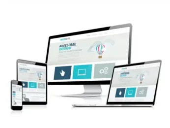
Ensure Your Website is Responsive

Responsiveness of a site is the degree of flexibility of that website on whatever device it’s been accessed on. This is especially important because an increasing amount of users now access the web through mobile phones and tabs rather than laptops and computers.

So, make sure your website is responsive. That means your site should contain the contents and information but a different display; that changes automatically depending on the user’s screen size.

Read more: 7 WEB Design Tips to Improve you site

10 Essential Features Of Good Ergonomic Design Tech Developers Often Overlook

When tech designers are developing a new website, app or product, they usually focus closely on functionality, ease of use and, most importantly, the user experience. But there’s more to a good user experience than attractive graphics or fun interfaces. The best-designed tech will always be centered on ergonomics—the ways humans interact physically and mentally with the tools they use, particularly in the workplace.

Tech hardware and software, as well as websites and apps, should always be designed with the health and comfort of the user in mind if they’re to be fully effective and inclusive. Below, 10 tech experts from Forbes Technology Council share important aspects of good ergonomic design that tech developers sometimes overlook and why it’s so important to get these features right.

1. ADA Compliance

Making your website ADA-compliant is not only the right thing to do, but it also opens your doors to additional visitors. Many low-cost tools make this an easy and transparent thing to do. Ensuring your site is ADA-compliant is a no-brainer. – David Moise, Decide Consulting

2. Hand Size And Reach

Tech developers often forget that with the larger size of modern smartphones, one-handed operation gives a typical adult thumb comfortable access to only the bottom-right two-thirds of the screen. Interface elements in the upper left of the screen are only accessible through uncomfortable contortions, secret OS features or by using your second hand. – Sam Glassenberg, Level Ex

Read more: 10 Essential Features Of Good Ergonomic Design Tech Developers Often Overlook