Menu

All posts tagged Website design

TotalWeb Partners: Six Essential Website Design Tips to Boost Your Sales

According to Forbes, the eCommerce industry is experiencing rapid growth year over year. However, this doesn’t necessarily mean that every eCommerce business is growing at the desired pace. Whether your sales are lagging or simply okay, most businesses are eager to accelerate their revenue growth. One of the most effective tools for achieving this growth is good web design.

We understand that every aspect of your eCommerce business, from your company’s logo to your website’s appearance and usability, to your marketing brochures, must be smartly designed to maximize the user experience. Conversely, poor design can significantly hinder your business’s performance.

Here are six ways to improve your website design to boost sales:

  1. Optimize Your Website’s Layout:
    • Ensure your website is clean and easy to navigate. An intuitive layout helps customers find what they’re looking for quickly, reducing frustration and increasing the likelihood of a purchase.
  2. Enhance Visual Appeal:
    • Use high-quality images and consistent branding elements. Visual appeal can make a significant difference in attracting and retaining customers.
  3. Improve Loading Speed:
    • A fast-loading website is crucial. Slow websites can drive potential customers away. Optimize images, leverage browser caching, and minimize code to improve your site’s speed.
  4. Ensure Mobile Responsiveness:
    • With the increasing use of mobile devices for shopping, your website must be mobile-friendly. A responsive design ensures your site looks and functions well on all devices.
  5. Streamline the Checkout Process:
    • Simplify the checkout process to reduce cart abandonment. Offer multiple payment options, guest checkout, and clear calls to action.
  6. Implement User Feedback:
    • Regularly gather and implement user feedback. Understanding your customers’ pain points and preferences can help you make informed design decisions that enhance user experience and drive sales.

By focusing on these key areas, you can create a more engaging, efficient, and visually appealing eCommerce website. Good design is more than just aesthetics; it’s about creating an experience that encourages users to stay, explore, and ultimately, purchase.

Click here to learn more about Total Web Partners’ services.

Article with all rights reserved, courtesy of forbes.com

Photo with all rights reserved, courtesy of depositphotos.com

Your website could be doing the environment dirty. Here’s how to clean it up.

No trees are seemingly cut down every time you Google something or read a social media post on your phone or laptop.  But websites alone do create emissions—internet usage is responsible for almost four percent of global emissions. That might not seem like a lot, but its equivalent to about the same emissions caused by global air travel. That percentage is predicted to almost double by about 2025 according to a post by Brussels-based energy magazine Energuide. And internet usage is on the rise– as COVID shut down the world last spring pushing many jobs and education online, internet usage went up as high as 40 percent, Yale News reported.

“The pandemic-related switch to digital has important environmental benefits, such as the reduction of travel-related carbon emissions, but the transition to a more digitally-centered world is not as clean as one might think,” Kaveh Madani, the Henry Hart Rice Senior Fellow at the Council on Middle East Studies at Yale’s MacMillan Center who led a study that outlined the internet’s environmental impacts, told Yale News.

The emissions caused by websites comes from the hosting company that ensures that websites are up and running when users search for them, on their server. By working with an environmentally-sound server like GreenGeeks, A2 Hosting, and HostPapa that focuses on renewable energy or lowering their energy usage, websites become more sustainable, Wired UK reported. Something as simple as using fewer images on a webpage also helps lower emissions. Another way to lower emissions is to have simply designed websites with little to no moving images like gifs.

“Images are the single largest contributors to page weight. The more images you use and the larger those image files, the more data needs to be transferred and the more energy is required,” Vineeta Greenwood, account director at design agency Wholegrain Digital told Wired UK.

Another aspect of creating more sustainable websites means raising awareness, or letting servers or customers in need of new web design know that it’s even an option for them. Some major search engines like Google have pledged to lower their tech centers’ water usage and to rely on more sustainable energy to run their search engines and other online products like Gmail and Google Docs.

Baruch Labunski,  CEO of Toronto-based SEO company Rank Secure, explains that when many clients work with the company to have their websites designed, they don’t often think about sustainability. Companies like Rank Secure make a point to have sustainability as part of their process when working with businesses who want help with web design by relying on more sustainable data centers.

Read more: Your website could be doing the environment dirty. Here’s how to clean it up.

How Minimalism leads to Effective Website Design

What Is Effective Web Design?

Everyone has their own definition of what effective website design and development is and it will vary from one individual to the next since people all have different preferences. Although personal preferences might differ, certain trends do emerge in artwork and design.

Web designers wanting to say ahead of their competitors will frequently just contact their users. When a website is being designed, a minimalist approach might be a highly effective way to connect with users. Designers will often focus on minimalism in order to ensure that the attention of users is focused on the aspects that are most important.

What Does Minimalist Web Design Mean?

Various design trends influence minimalism. Minimalism is about simplicity and staying focused on a design’s most important aspects. Using this approach can demonstrate a subject’s true form and draw out its uniqueness and elegance.

Minimalism in web design aims to avoid making web design mistakes by eliminating aspects that might cause users to lose their attention on the design. The strategy makes it possible for web designers to focus on a design’s most important elements. The user interface can be simplified and unnecessary elements can be eliminated

Minimalist Web Design Features

A design technique’s popularity does not necessarily translate into user needs being supported. The goal of minimalist web design is to create focused imagery in order to create an effective link between the website and the user.

Read more: How Minimalism leads to Effective Website Design

4 Elements of Modern Website Design You Need to Know About

Every business needs a website. No matter what industry you are in, a website can help you boost your visibility, gain more exposure, generate leads, and ultimately boost your sales for more profit.

But that’s not it. There’s so much more a website can do to help your business become successful. For example, most customers will visit your website and take a tour of it before they make a purchase. You can use this opportunity to highlight your offers and convince them to buy more.

You can even use it to build credibility by displaying customer testimonials. Many marketers also offer customer support through their sites. In a way, your website is one of your biggest assets in helping you create a successful business.

So it’s important for you to design it with all the modern elements that can not just boost user experience but also help you remain at the top of your marketing game.

But how do you do that? If you’re not sure how to create a professional website complete with all modern elements, stop worrying now. In the following section of this article, we’ll tell you about some of the most important elements of website design that can keep you ahead of your competitors.

So let’s find out,

1. Optimized Speed

Imagine a situation in which you excitedly land on a website, hoping that you’ll make some purchase. But as you browse through it, you have to wait endlessly for a single product to be fully visible. The website is so slow that the loading sign doesn’t seem to disappear. What would you do? Keep scrolling or opt-out of the website?

If you chose the second option, you’re definitely on the right track. No one likes slow websites. Sites that take longer to load have a higher bounce rate and lower average time on the page. Not to mention, it majorly affects your conversion rate too. According to reports, even a single-second delay in your loading speed can bring down your conversion rate by 7%.

If you don’t want that to happen to your business, you have to optimize your website speed. It’s one of the most important elements of web design that can improve the user experience on your site. If your site takes longer than 1.7 seconds to load, it’s time to work on optimizing it for the best results. The low speed can be because of your web hosting service, unoptimized images, bulky files, etc. Figure out the reason that’s causing it and fix it at the earliest possible.

Read more: 4 Elements of Modern Website Design You Need to Know About

A Website Design Can Make Or Break A Company

It is very important to have a professional website in order to make itself known and promote its activity to your customers.

Creating a professional website is not easy. In general, it requires the intervention of a web agency. This allows the new business to obtain a good quality professional website.

Why should new businesses create their website?

The professional website replaces traditional business cards and commercial brochures. The first instinct of a potential customer who is interested in your business will be to search the internet and social networks.

If a user cannot find information about your business, it will inevitably create a trust problem. In addition, research is very likely to land this prospect on the website of one of your competitors.

Your professional website, provided it is well referenced on search engines, will be an excellent commercial tool for your business.

Then, when the website is efficient, it will allow you to create a first bond of trust with your future customers.

What information should be indicated on a professional website?

The main objective of your website is to provide as much information as possible to Internet users about your activity.

The richer and more precise the information, the more likely the Internet users who will contact you will turn into customers.

The observation of competing websites is rewarding. This makes it possible to identify the important elements to be provided on your website, and to observe their practices.

Basic information

First of all, the website should offer a complete description of all your activities . A surfer should immediately have a glimpse of what you are offering.

For a service provision activity (consultant, freelance, trainer, coach, etc.), it is important to highlight the list of proposed assignments, your professional background, your diplomas, your skills, your experiences within different companies.

For a trading activity, it is necessary to present the range of products offered by the company, in detail and highlighting its advantages.

Read more: A Website Design Can Make Or Break A Company

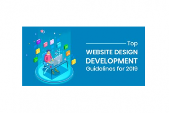
Top website Design and development Guidelines for 2019

Website designing is the process of creating websites. It requires many skills and techniques to create and maintain website. Many web designers are not care about design standards. But it is important for web designing.

In today’s market, it is important to have online presence. An interactive website is must for digital presence. Unluckily, internet is crowded with poor website designs which miss both technical and content mark. Some web designers have lack of understanding of programming languages. Now it is time to stop the bad websites.

This article will provide you some guidelines for designing a good website. Best web developers always keep in mind the guidelines and certain set of rules.

A good website is the basic requirement of every Company. A website is designed according to the customer’s requirements. Our company provides custom software development service so that we are able to create a customized website.

Guidelines for web design and developers
For designing a website, website designers require various techniques and guidelines. They can create a good website by following these guidelines. Custom web development software helps the web designer to easily create a website.

Below are the guidelines to keep in mind while designing a website:-

1. Immediate Page Loading

Visitors never wait with patience for a website to load. If your website is slow and takes a long time to open then it can’t be considered as an ideal website. Therefore, design your website by using quick loading rates. High conversion rate is another benefit of designing a fast loading website.

2. Mobile- Friendly

In the world of smartphones, ensure that you create a mobile-friendly website. Designing a responsive website that loads perfectly on any mobile is the best way to win the user response.

3. Responsive designs

Responsive design is the contrast of programming and device which is difficult to add after a specific website is designed. It is mainly a part of a redesign. That is why it is a compact, not a Company standard. Responsive design has been regularly changed over the years.

Read more: Top website Design and development Guidelines for 2019

4 Trends in Website Design That Small Businesses Need to Know

Small businesses are an integral part of our economy. Every business aims to solve a problem and create value in doing so. This is particularly true of small businesses. They provide a service or product that meets local needs and can fulfill requirements for larger businesses.

The benefits of small businesses are numerous, but often they can have difficulty creating, sharing, and establishing their message. Entrepreneurs, startups, and freelancers watch their budgets carefully, and expenses outside of delivering the product are kept to a minimum. That means marketing budgets get shaved first.

Websites for any product or service are today’s version of a first impression. Consumers make a variety of instant decisions about whether to continue on a site or jump to a competitor’s. A person’s eyes take just 2.6 seconds to focus on a particular element of a webpage when it loads, according to research from Missouri University of Science and Technology.

Brands working to establish and expand their digital identity can expect to see increased competition for consumer attention online. Consumers increasingly form opinions about brands on the basis of their browsing experience, making it imperative to establish a positive digital identity. Here is what we can expect in the evolution of small-business website design.

1. Less reliance on custom code

Businesses have traditionally hired design firms to design their websites. Websites are perceived to be difficult to create and highly technical to maintain. But platforms that allow non-tech savvy individuals to develop their sites in a drag-and-drop format have begun to rival the value of web design firms. For small businesses, do-it-yourself websites are a viable alternative.

The less you rely on coding to create a beautiful site, the less complicated it will be. Uri Foox, president of the e-commerce website design platform Zoey, says that despite SaaS platforms’ ability to remove much of the complexity associated with running an online store or website, code is still needed to customize the front-end design of a site, for almost all platforms.

Read more: 4 Trends in Website Design That Small Businesses Need to Know

New Web trends: Immersive Interaction Design

The wheel of progress is changing what we think of as “new” or “old,” and users can easily scorn the sites and apps they loved only a few months ago. But for every door that technology closes, a new one is opened. The Good News… Since inception TotalWeb Partners has building the immersive interaction designs into all sites we build.

Below we’ve collected some of the modern IxD techniques that users are flocking to. Some are genuinely new, while others are just new takes on old ideas. Either way, they’ll help you stay ahead of the curve…and the crushing wheel of progress.

1. Animation & Transitions
When it comes to interaction design, one of the most popular concepts is animation and animated effects. Animation can include anything from a cool hover state effect to a full-screen cartoon that plays in the background.

Animations may not be new to interaction design, but their popularity is really only possible thanks to developments in HTML5, Javascript, and CSS. While they were once considered an aesthetic luxury (“Wow, the icon bounces!”) during the age of Flash, they are now becoming a functional necessity (“Ugh, the icon doesn’t do anything except bounce?!”).

Read more: New Web trends: immersive interaction design

New Website Design Trends We Predict In The Near Future

Change: It’s a word us digital marketers have gotten very accustomed to using on a daily basis. I supposed anyone who is online — let’s face it, that’s just about everyone — has become accustomed to the word change.

A lot of people cringe when they hear the word change, but for us digital marketers, it only means more opportunity. There’s changes on social media, search ads, Google, just about anything. But what about website design?

Website design has been around a long time, since the stone age. It’s obviously come a long way, but what can we expect to change in the near future. Let’s take a look at 3 changes we expect to see this year with website design.

Content Change

This is a big one, because, as we’ve heard a million times, Content is King!! As if that hasn’t been pounded into your head enough.

But the way we use content on a site is beginning to slightly change, mostly from a informational standpoint to a storytelling type of content. Websites used to be, and a lot still are, all about giving the facts about your business then pointing them to the checkout lane, or whatever the final conversion may be.

Read more: New Website Design Trends We Predict In The Near Future

5 metrics that affect the success of your website redesign

When you’re undertaking a website redesign it can be tempting to rush in with the excitement of new possibilities, but it’s important to consider the key aspects of a redesign, both aesthetically and from a business perspective. In order for the process to be successful these two must be aligned if the new website is to provide a high return on investment.

Undertaking a thorough review of your existing website is essential, along with evaluating your content, analytics and calls to action to see how well each is currently performing. If you haven’t re-designed in some time, the online social landscape has changed dramatically, and if you want your business to thrive, you need to embrace both social media and technology to efficiently deliver your product or service to a wide audience. Once the re-design is finished don’t leave it to gather dust. Aim for constant measurement and enhancement. Analyzing your redesign efforts with these five key areas will help you develop a cohesive plan and ensure your re-design is a success.

Read more: 5 metrics that affect the success of your website redesign  

TotalWeb Partners Hear about our latest news and updates before anyone else.
Dismiss
Allow Notifications